


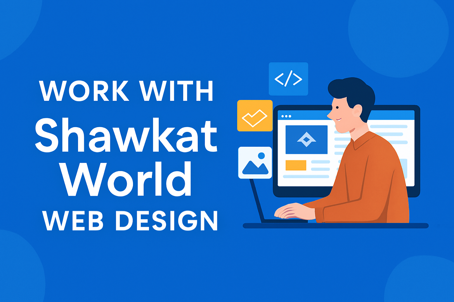
Who We Are and What ShawkatWorld Web Design Offers
ShawkatWorld started with a simple idea: make web design accessible and stress-free. Many people feel overwhelmed by hosting, plugins, or layout choices. We remove that friction with clear, affordable, and personalized solutions. Our background in WordPress development, branding, and multimedia allows us to create websites that look great and are easy to manage.<br><br>Custom, mobile-friendly WordPress sites designed for speed, SEO, and easy updates — blogs, landing pages, business sites, and event pages. We follow best practices recommended by <a href=”https://wordpress.org”>WordPress.org</a> to ensure your website is secure, modern, and optimized for long-term performance.
Learn more about us